The work below was created while I served as the Director of Creative and Branding at Rippel. It represents only a portion of my projects.
All displayed work is legally permitted, via linking to the website.

Brand Identity Story
The Rippel brand identity consists of a fully custom typeface and icon. The hexagons symbolize our interdisciplinary approach to studying complex, adaptive systems, drawing references from both chemistry and honeycombs. Just as bees serve various roles as stewards of their environments, we aim to integrate insights from natural and social sciences. Hexagons serve as a valuable brainstorming tool for systems thinkers, enabling the arrangement of ideas and insights into diverse configurations. When arranged, the hexagons create patterns that feel dynamic and alive, with their colors reflecting
the diversity of disciplines involved in systemic change and the potential for new connections. In terms of branding, the filled teal hexagon, which serves as the dot on Rippel’s “i,” matches the adjacent open hexagon, reinforcing our brand identity. Additionally, the custom font designed by Bradley Girard sets our brand apart; the modern “e” draws inspiration from the Kabel font, breaking away from traditional styles to convey a more humanistic feel. Rippel’s practices strike a balance between tradition and innovation, while the capital “L” in our font clearly differentiates Rippel from similarly named entities.

Nested Brands
Use of Rippel custom typeface and alignment with the main brand logo hexagon theme.
- ReThink Health – Hexagons represents partners working closely together to improve health and wellbeing.
- Rethinkers Collaborative – Hands within the hexagon represent team collaboration.
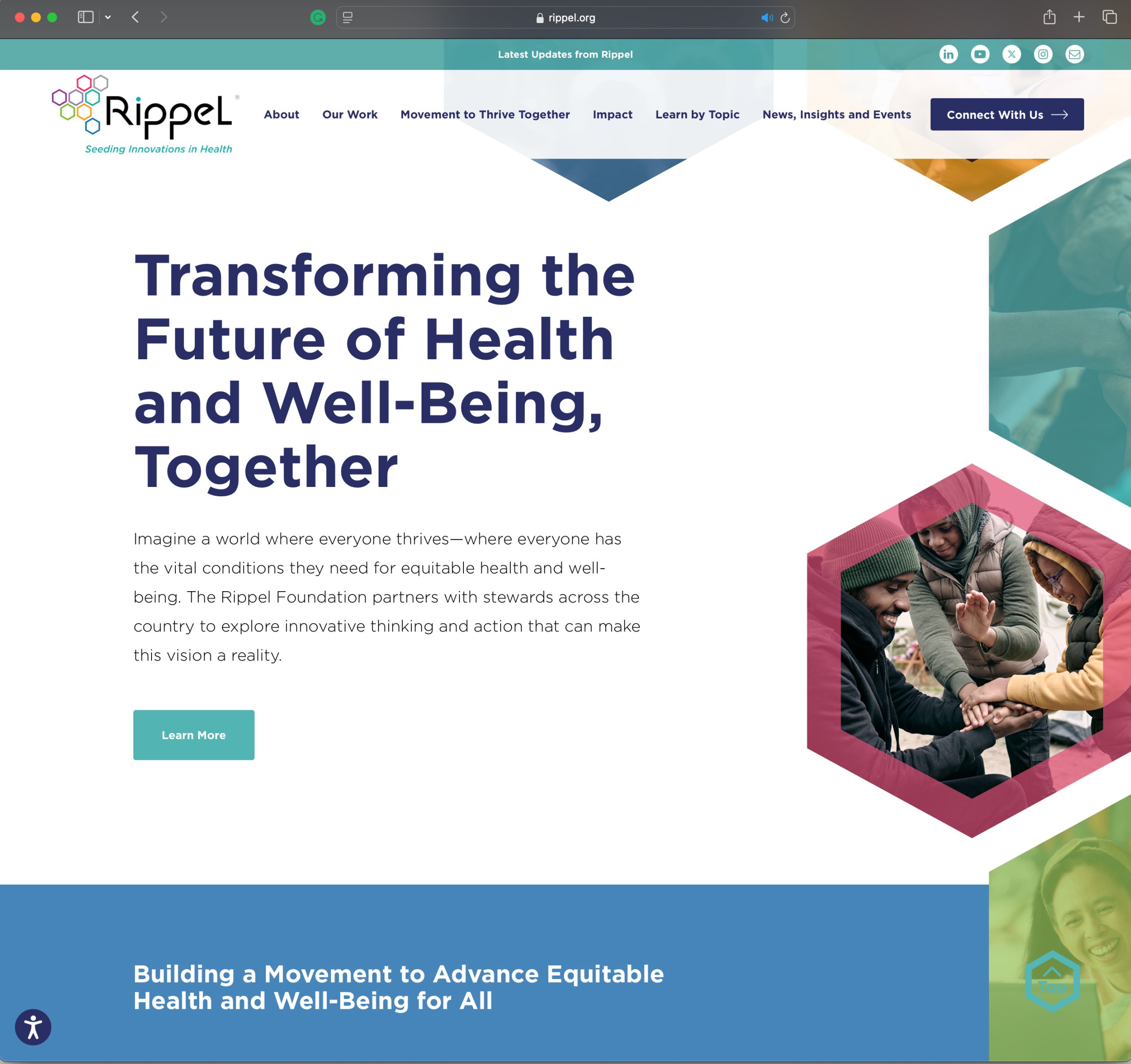
Full Bespoke Redesign of The Rippel Foundation Website
A redesign of the Rippel website was necessary to align with the new brand identity, enhance user experience, improve search engine optimization, and ensure compliance with the Americans with Disabilities Act (ADA). As a result of these changes, site traffic increased by 43%, and average user engagement rose from 1.2 minutes to 3.5 minutes. Several online tools were introduced, including a podcast, an interactive online report, and a dynamic “Learn-by-Topic” portal, which together contributed to a 26% increase in website engagement compared to the previous year. The hexagon theme, representing systems thinking, was utilized throughout the website as a cohesive brand element.
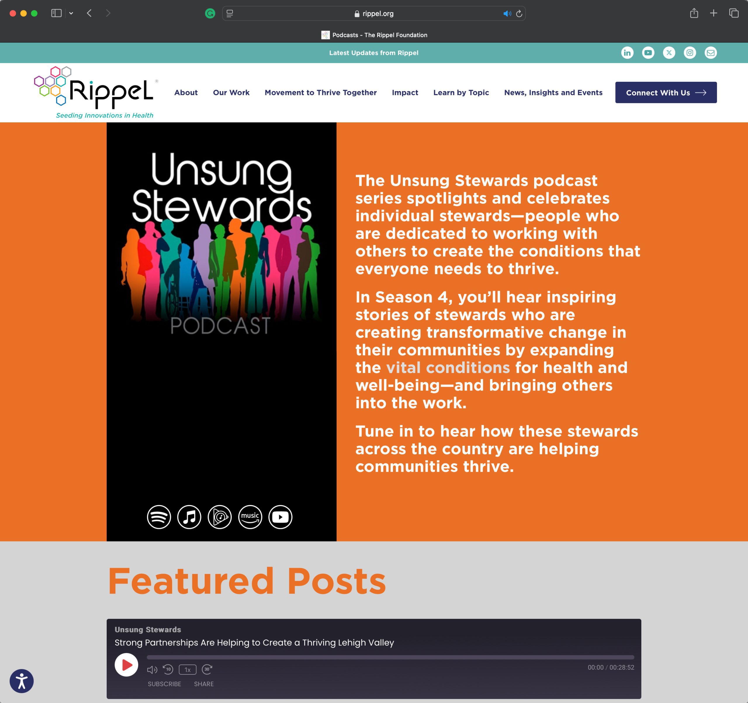
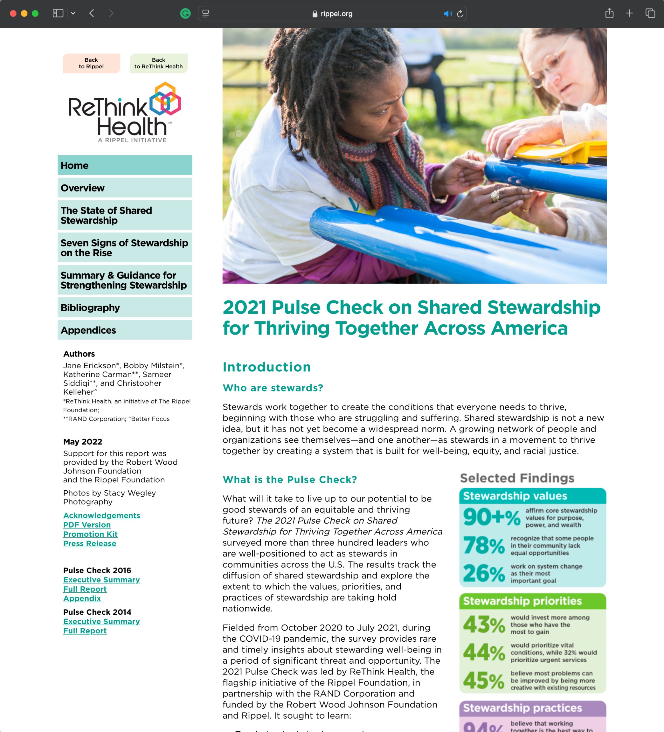
Online Engagement Tools
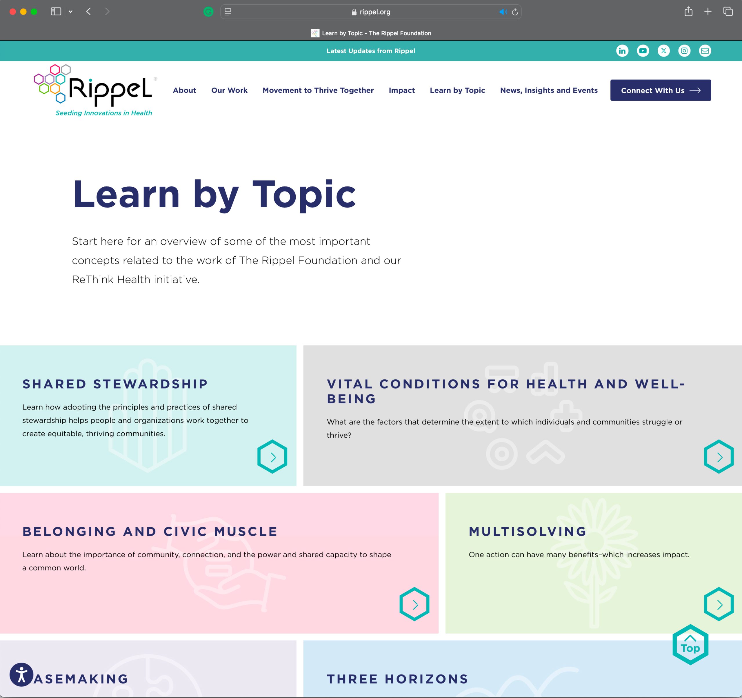
We created and launched several online tools to boost website engagement. These include the “Unsung Stewards Podcast,” which shares inspiring stories, the “Pulse Check,” an interactive online report, and a dynamic “Learn-by-Topic” portal that allows users to explore subjects at their own pace. Together, these initiatives resulted in a 26% increase in overall engagement.
Unsung Stewards Podcast
Pulse Check Report
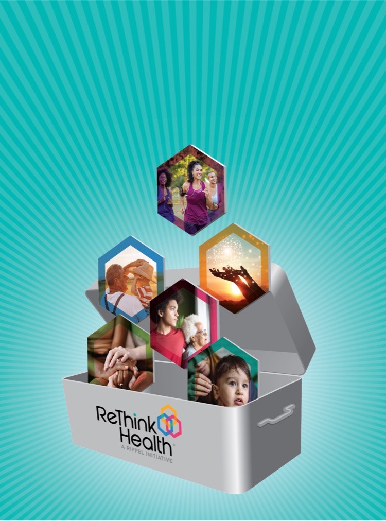
Learn by Topic Portal
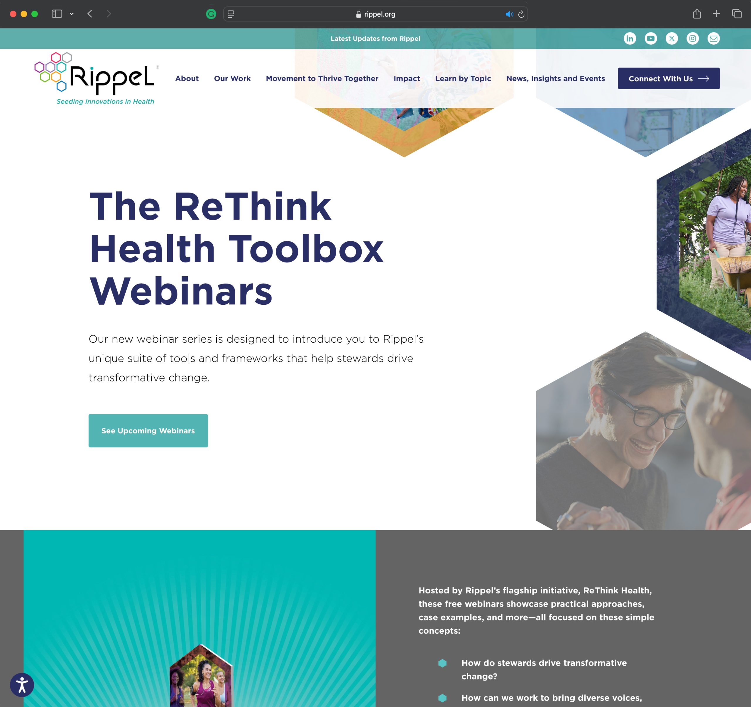
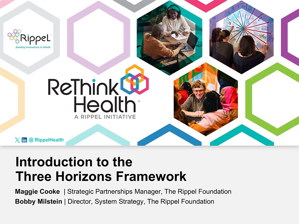
ReThink Health Toolbox Webinars
The ReThink Health Toolbox webinar series was designed to introduce Rippel’s unique suite of tools and frameworks that help stewards implement transformative change. The campaign featured online registration for the webinars, social media promotion, a dedicated webpage, PowerPoint presentations, and a video for each webinar. This initiative served as an additional method to attract users to the website and engage them with the content.
Toolbox Webinar Icon
Webpage
Powerpoint
Video
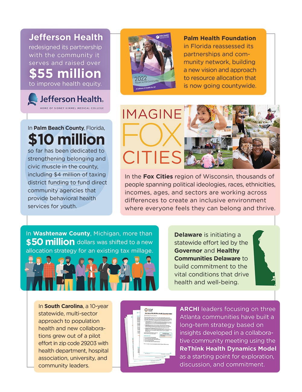
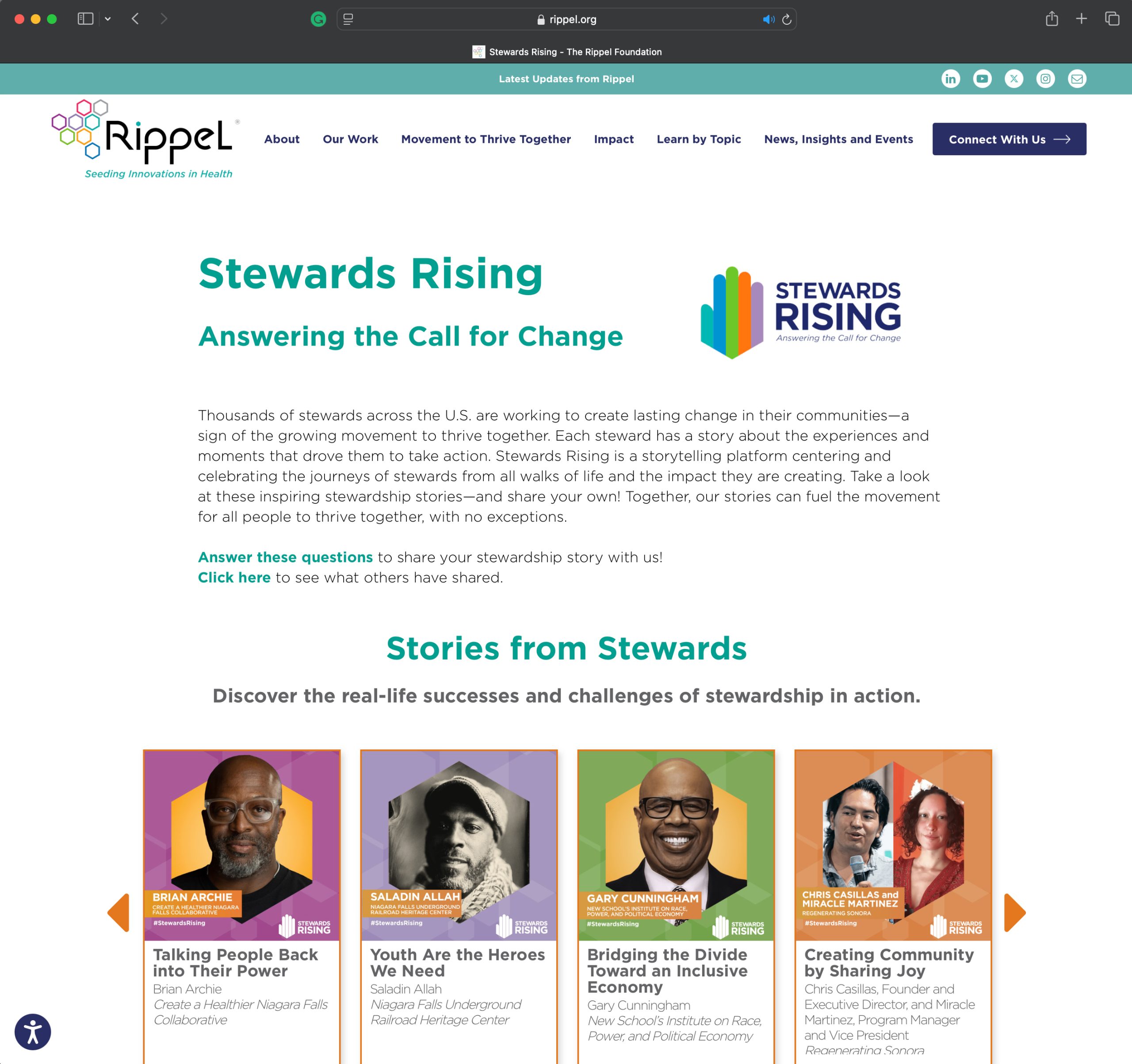
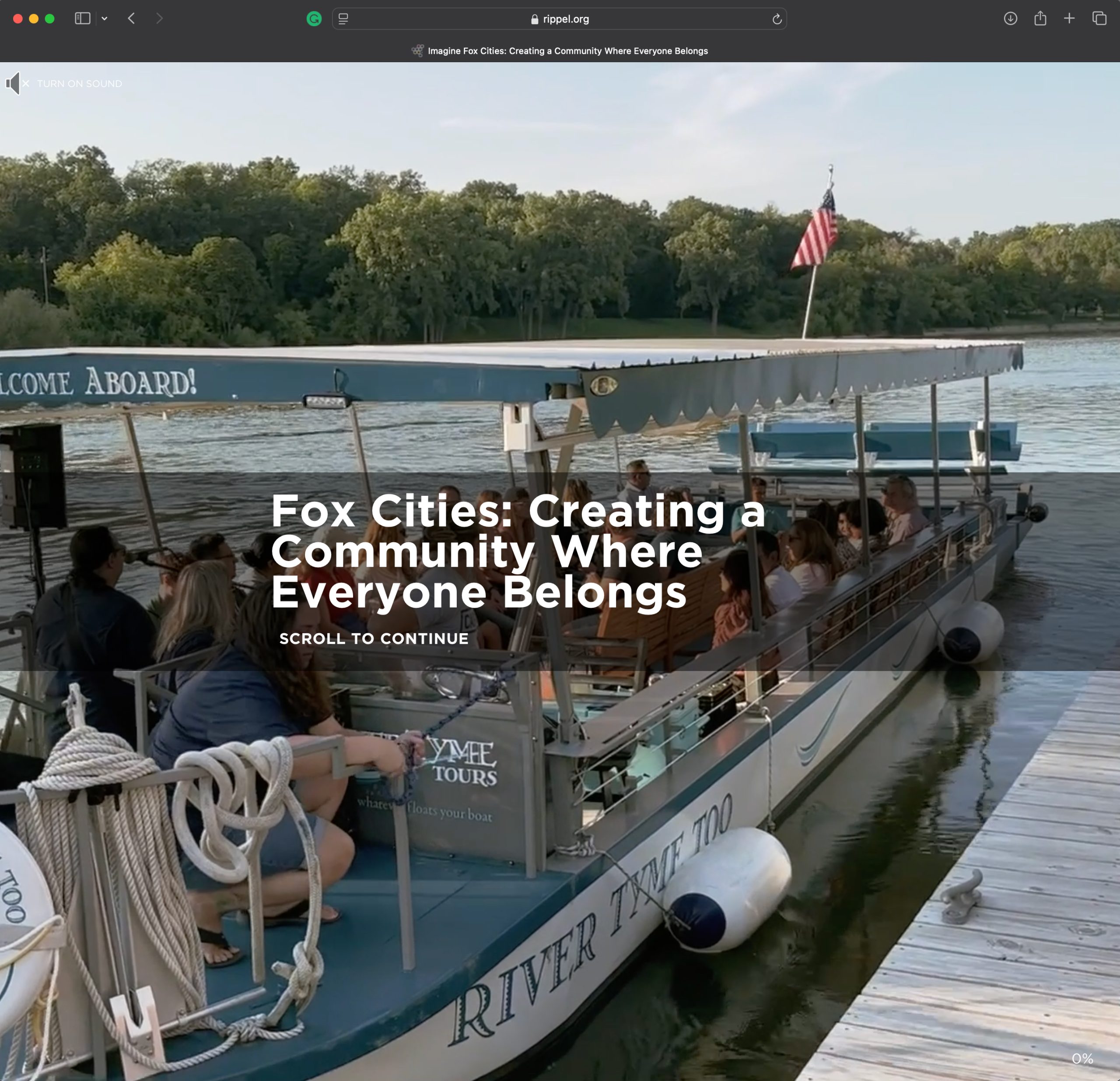
Stewards Rising Campaign
Thousands of stewards across the U.S. are dedicated to creating lasting change in their communities, reflecting a growing movement to thrive together. Each steward has a unique story about the experiences and moments that inspired them to take action. Stewards Rising is a storytelling platform that highlights and honors the journeys of stewards from diverse backgrounds and the impact they are making.
Stewards Rising Logo
Video
Webpage
Multimedia Narrative
Branded Collateral
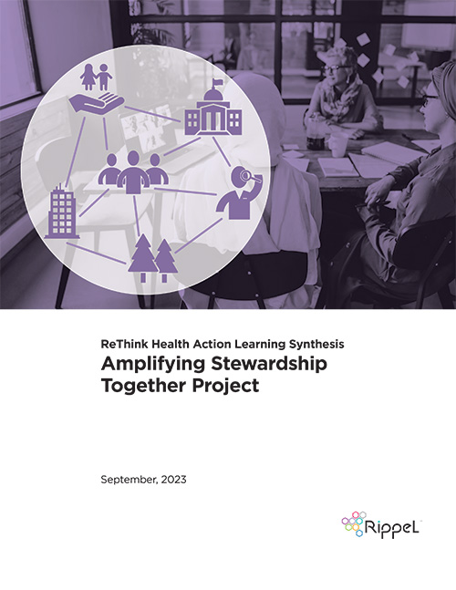
AST
Action Learning Synthesis
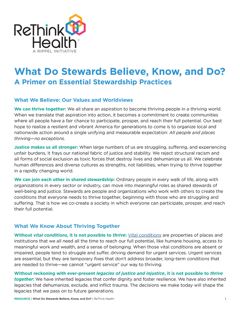
15 Essential Practices
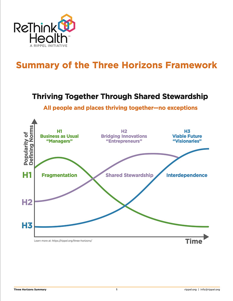
Three Horizons Framework
PDHR
Action Learning Synthesis
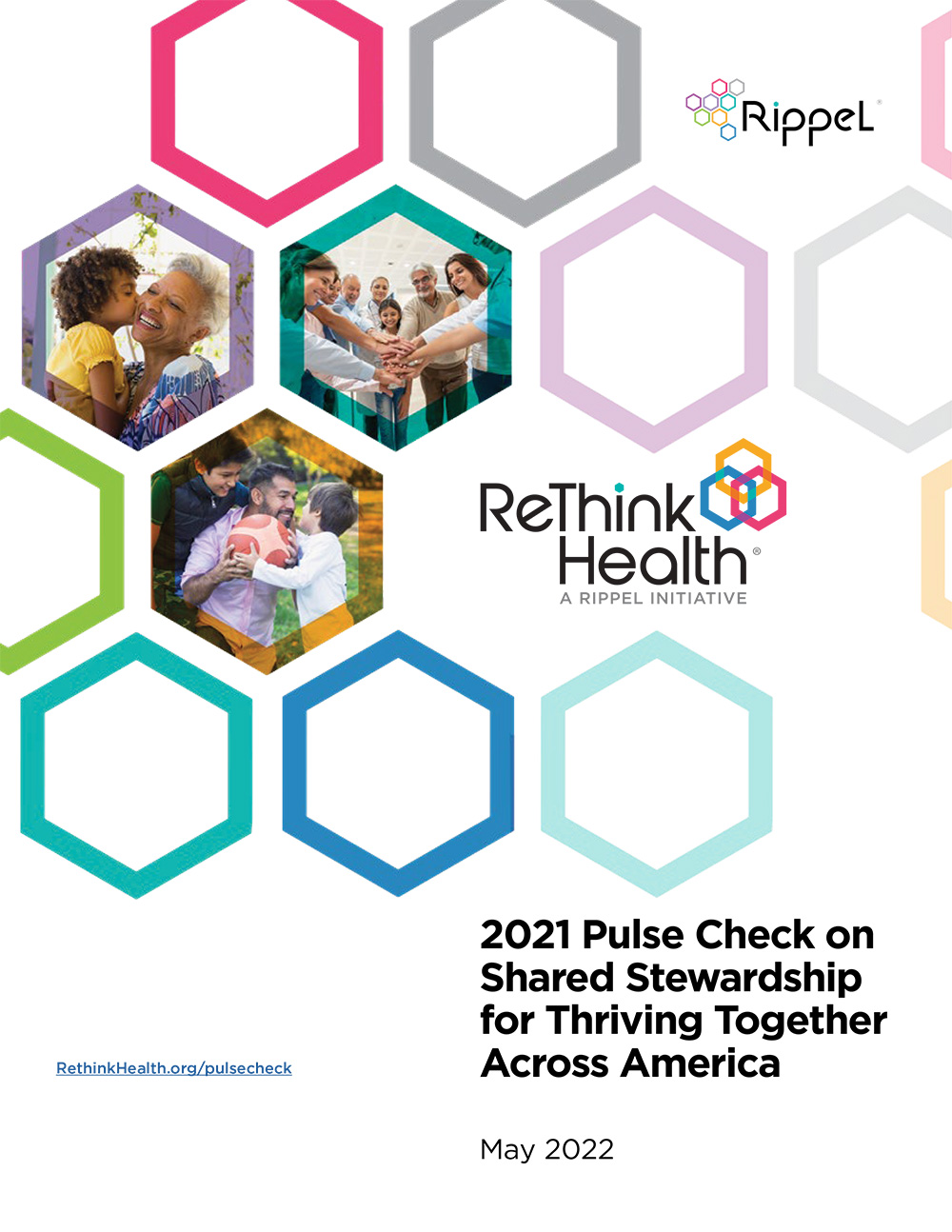
Pulse Check Report
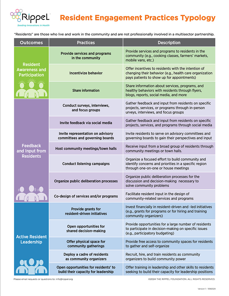
Resident Engagement
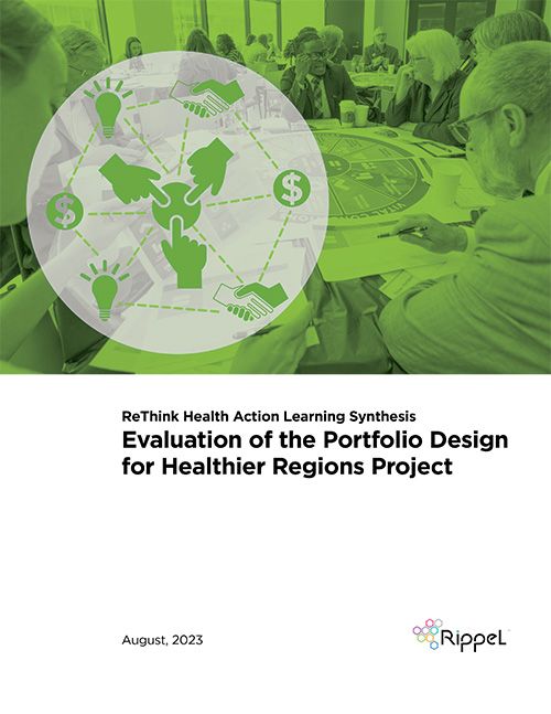
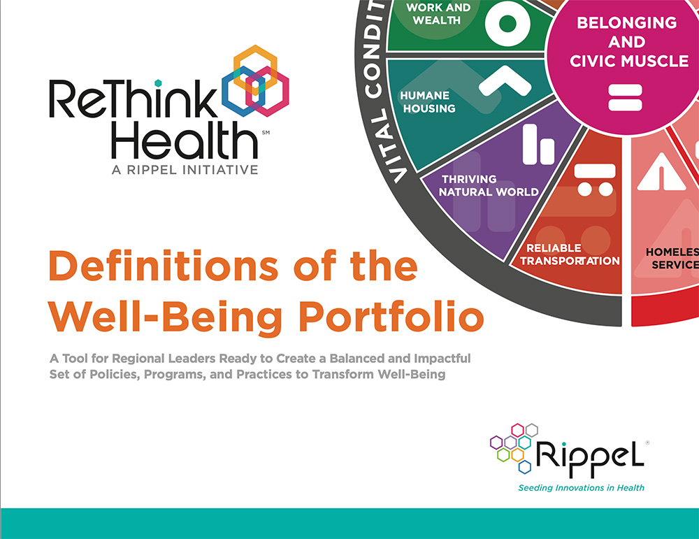
Well-Being Portolio
HST
Action Learning Synthesis
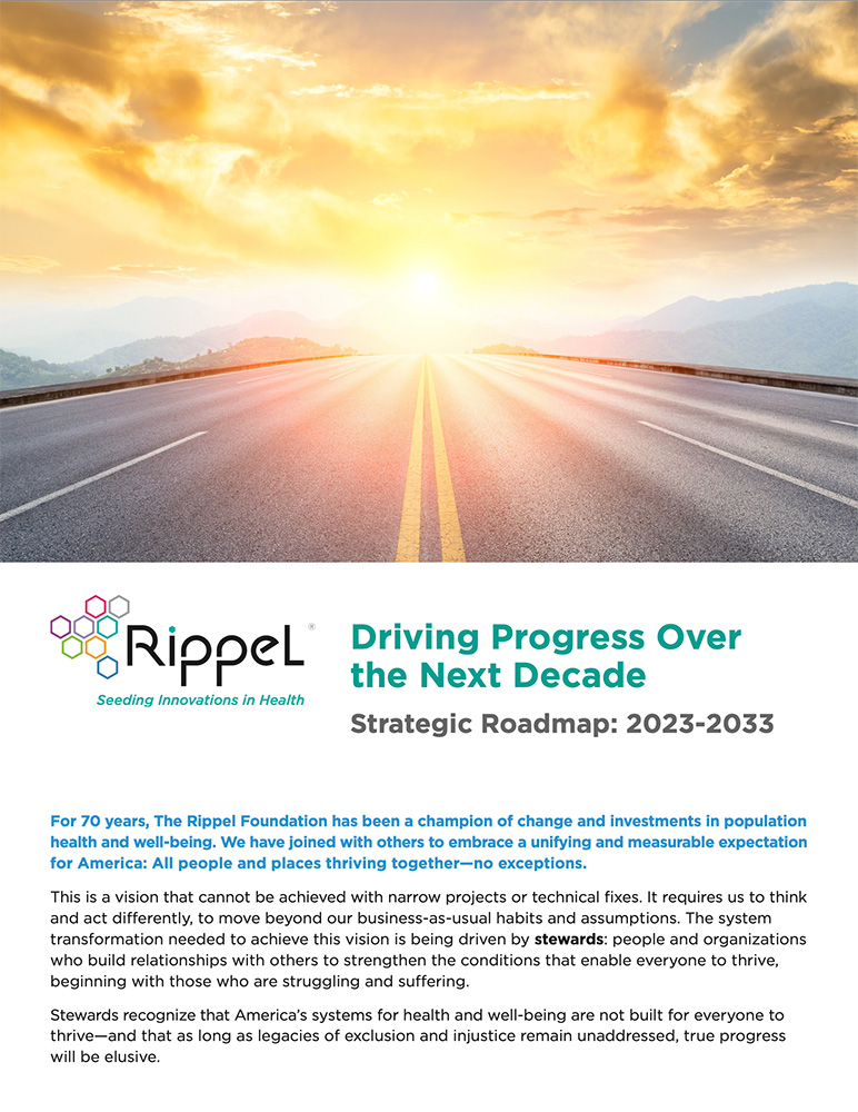
Rippel Strategic Roadmap
Info Graphic